
The dot plot, as it's colloquially known, shows where individual Federal Reserve officials predict interest rates going in the future.
Formally known as the “Summary of Economic Projections” (SEP), the Fed releases the dot plot every quarter (March, June, September, and December). It is scrutinized by Wall Street the minute it comes out.
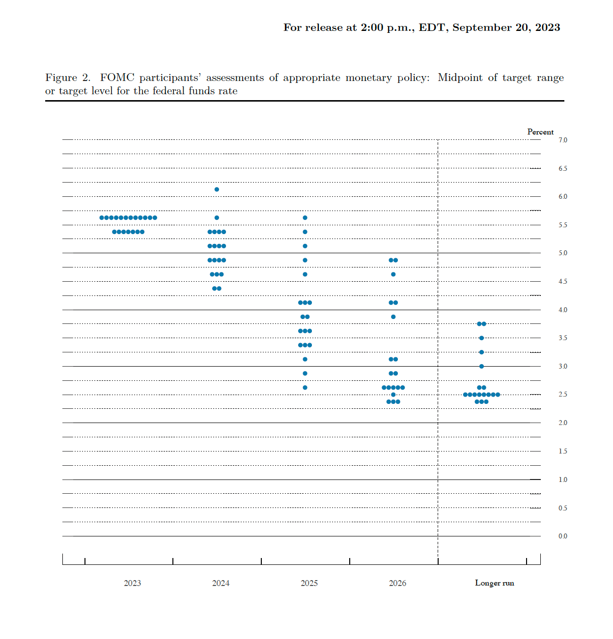
Here's a past example:
The Fed's current dot plot
Here's a current view of the median dots (Fed rate predictions) from the latest dot plot.
What this shows is the midpoint of Fed projections for the "appropriate target level for the federal funds rate at the end of the specified calendar year," says the St. Louis Fed. "Each participant's projections are based on his or her assessment of appropriate monetary policy."
The Fed forecast shown here goes out a few years, but the actual releases also include a "Longer-run" dot (projection). This is essentially the Fed's opinion of the estimated #neutral rate#. For that, and the full SEP, visit federalreserve.gov.